Friday, August 24, 2012

Thank you, typography rabbit trail

I have a customer/friend who has been extremely supportive of my work.  There is one phrase she uses like Bostonians use the word 'wicked'...i.e. "Hey you worked wicked hard, you deserve that beeer".  Anyone from Mass knows to drop the 'r' and add a 'ah'.

So the phrase my friend uses is 'hot mess'.  She is the first person I've ever heard use it and I'm assuming people in the mid west anywhere Illinois use it without thinking.  Teachers telling their 'F' students they are hot messes.  Judges assigning probation officers to their 'hot mess'.  Wives kicking their hot mess husbands around the house to clean up after themselves.

I'm told the phrase means someone is messed up.  Just picture a spilled bowl of potato soup on the floor.  It's to hot to clean up and is ignored until the time is right.

My friend dropped this phrase often enough that I needed to commemorate it in some way.  Possibly, put it on a t-shirt or something.

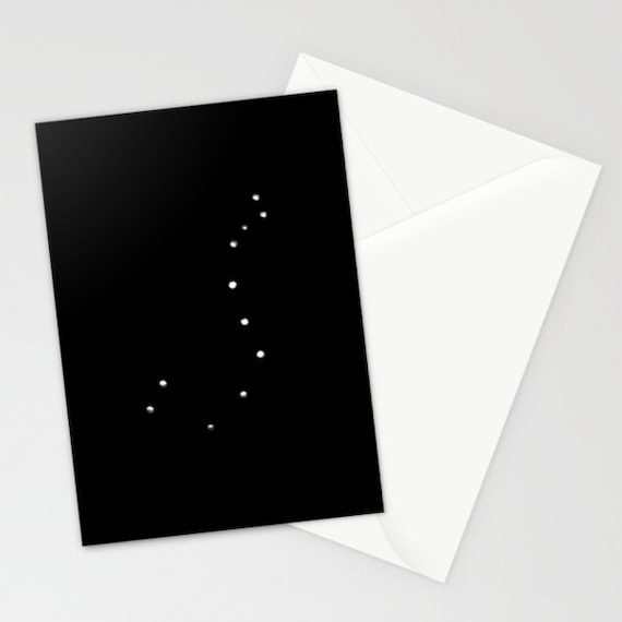
I drove during my lunch hour to Heart Pond, where I've done a lot of t-shirt illustration and made this:

Heart Pond, Chelmsford, Ma.


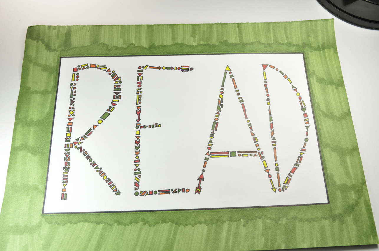
I presented this first design to her and she told me to redo it.  Change the style to bubbles + add more pink flames.  Since she was the queen of knowing who was and wasn't a hot mess.  I took her advice and started right away.

While watching TV with my son and writing out a hot mess bubble style, I remembered a trip I took out to Marlborough, Ma's Borders bookstore a year ago with him.  The store was closing down, and everything was steeply discounted.  Jet Tea smoothie boxes, ice machines, books, calendars, toys and more all discounted heavily.  I figured my son would enjoy seeing the selection of toys and I would enjoy dropping very few pennies on them.  An acquaintance of mine bought up all the coffee making equipment and started a coffee house in Worcester, MA.

There were several out of business signs in the store windows and throughout the store.  Frenzied shoppers contrasted against the somber looks on the Border's employees faces.  These employees looked like book geeks who were extremely knowledgeable and some I met had a wonderful sense of humor.  It is pleasurable to see people behind a cash register who love what they are selling and share thoughts on what shoppers have chosen to buy.  The attendant peered at my items spread across the counter --a balloon powered car, strawberry jet tea smoothie boxes among other items-- and made a few comments.  My son slipped a last minute toy in and I totally caved.  The attendant noticed I slipped something in last minute and she was exited to see the calligraphy set.

I brought the same calligraphy kit home and my wife figured I'd try it and move on.  That's exactly what happened.  My main issue was with using a thick chiseled pen and keeping it the same orientation while I moved my wrist.  Some movements left a flat line. and other movements left broad line.  The kit came with pens of varying thicknesses, paper, and a thin book with some info on calligraphy.  Eventually the novelty wore off and the kit's pens were left in my desk drawer for months without being used.

Writing 'hot mess' over and over moved me to pull out what I learned about calligraphy and the 1 typography class I took at Framingham State.


I loved the contrast between what seemed so common with what appeared to be refined.

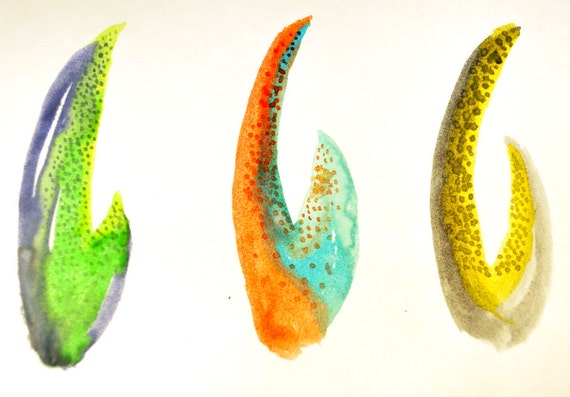
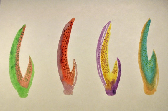
Eventually, I started thinking of making cards with this style of writing and experimented with other
spins on thick and thin lines.  I made these 'Thank You' as a result of the last couple of days experiments.

https://www.etsy.com/listing/107650345/thanks-thank-you-card

https://www.etsy.com/listing/107650309/thanks-thank-you-card


Tuesday, August 21, 2012

Practicing a purled ladder stitch illustration

Definitely takes a while to finish and I'm just drawing it!! I'm trying to focus on a consistent feel throughout the pattern. May use this on a tee.

Currently reading: book on patterns, website on stiches

And by reading I mean skimming through the pics.  Whenever an images catches my eye, I start staring at and sketch when I feel an ounce of inspiration.

1) Old book on patterns:  http://books.google.com/books?id=ObBNAAAAMAAJ&pg=PA58#v=onepage&q&f=false

and

2) Various stiches: http://www.knittingonthenet.com/stitches.htm

I ended up sketching this after seeing a few patterns on knitting on the net.

Wash Test: Sharpie Versus Dick Blick Block Print Paint

I really enjoy working with sharpie's brush tip markers.  They are perfect for writing + drawing on shifting t-shirts material.  The only setback is they don't have that immediate painted look that is quite attractive and seen with inks for linocut or block print.  This thicker painted look takes several layers of ink.  I grabbed dick blick's block print inks and made a tshirt.  I also grabbed one of my sharpie brush tip drawn tees and threw them both in the wash.  I've done 2 washes so far and the results were a bit surprising to me.

Before washing:  Sharpie Fabric Pen on the left, Dick Blick Block Print Ink on the right

After the 1st wash

I'm not sure if I was supposed to add an additional varnish or protective layer to the blick paints but they flew right off.  My washing machine was not tinted red and yellow, in case you were wondering.

It seems like the sharpie fabric inks stayed put!  After doing this little test, I realize that writing "wash 1" or whatever wash I was on after each wash would help me organize my results.

Other washing info:
- T-shirts were washed and dried before any fabric ink or paint was applied.
- After the t-shirt was drawn on or painted, it was flipped inside out and washed with cold water with Method pump detergent.

Only dye bleed was from the Hanes logo tag (go figure) and I cut those tags after the first wash.  I have a few more hanes tees left, but I've purchased white Gildan t-shirts, and hemp, bamboo, and organic cotton tees + bags from ONNO for prime time which is a craft fair in October and the Winter 2012 Bizarre Bazaar (if I get in) in December.


Monday, August 20, 2012

Watercolors

I've goofed around with watercolors over the past year and I've done a couple sessions with my son.  This weekend, I decided to make these after remembering Saturday's seafood lunch.

https://www.etsy.com/listing/107297934/crab-claw-no-2-watercolor-7-x-10

https://www.etsy.com/listing/107297828/crab-claw-no-1-watercolor-7-x-10

I originally made 2 and showed them to my wife.  She remarked on the traits she liked best and I used that to do a few versions.  Laying down colors, smearing them together, then returning to add finishing touches was a fun process!  After screwing up a couple pieces while making the dots, I learned to release most of the paint on a nearby cardboard surface.  All dots afterwards came consistently and only required a dab from the tip of the brush.

The experience was quite pleasing and has me curious about how others before me have approached the same medium.


Friday, August 17, 2012

Zodiac signs / Scorpio

Just a brief thought on some reading I've done.  I don't necessarily believe horoscopes, but I've read through generic statements about zodiac signs and personalities associated with them.  It seemed quite accurate!  I'm a scorpio and the gist of this sign is that I'll be driven by passion.  The weird thing is the description supposedly applies to anyone that is born near my birthday.

I don't have a quick way of finding out how true the personality descriptions are, but there is a truth to seeing
things that are true of me.  In trying to design something or illustrate, I don't need to go to far, because there are things that speak to me and others in my boat.  My October fellow babies, illustrators,  coffee lovers, travelers, and gardeners.  We all have similar desires and these passions unite us before we've even met.

Thursday, August 16, 2012

T shirt time!

I love t-shirts!  I've always wanted to try putting designs on t-shirts and I have taken a few steps towards that path.  I want to see how the fabric inks hold up to being washed, but I love the process of drawing on a shirt or carving out patterns out of blocks.  I plan on posting the process from start to finish after a few more experiments.

I used sharpies fabric markers for the intricate geometric t-shirt and eye t-shirt.  The large fall color prints were made by carving out rubber blocks.  


Tuesday, August 14, 2012

Experiment #1: Reusing an empty Tera's Whey Canister in Photos


Hi! I'm Ruben.  I've been photoblogging for around 2 years over at sqwair.blogspot.com.  I'm going to be doing photography experiments along with others performing creative experiments as part of a group experiment executed by Tara.

I had the monday morning blues and I needed a pick me up.  99% has been an incredible resource for productivity tips and always has challenged me so I naturally went to the blog looking for new articles. After watching a video and reading this blog post, I wanted to continue on my personal goal to have 100 photographs or illustrations available for viewing and purchasing.  I currently have around 60 unique listings on my etsy shop now.


Video I saw from Tina Seelig's TedX talk:


The concept I walked away with was to use resources that are nearby and free.  I looked through my recycle bin and my family had just finished a Tera's Whey canister of protein powder. My son, Max, saw me messing with the cylinder and before his bedtime I showed him how to spell out letters one poke at a time.  Writing on the can and poking with a push pin every 5mm worked best.


I held the canister to the light and wedged a rock underneath to keep it in place.  All lights in the room were off except the light shining through the canister.


Scorpio Constellation


These concentrated lights made me curious to see how an out of focus, a.k.a bokeh, approach would look.


Used yellow/orange tissue paper.
Used a handmade filter to change the light color (I'll explain this in  a blog post coming shortly).


The 1 class I took from David Wells at the Worcester Art Museum several years ago emphasized always trying several settings because you never know what will look good.  Slowing down the shutter speed would allow more light in.  I definitely wanted to see points of light and have it surrounded by pure black.  I didn't want to see any writing from Tera's Whey in the picture.

Exposure time set to 1/500th of a sec versus the previous settings which ranged between 1/1000th and 1/2000th of a sec.
I went to sleep at 2am that night!  Between my day job and when all in my house go to sleep I often will stay up very late to get a few hours of creative time in.  I do best when I'm not confined just to my lunch hour during the day.

The following morning I woke exhausted + running behind schedule to get to work, but I was also remarkably cheerful knowing what I had done the previous night.  I imagined the canister lit up showing constellations and thought about how I could make it better.  Several movie scenes show a shaft of light from the sun or a flashlight in dark areas.  I knew the light path would need to be smoky or dusty to be seen.  After work, this desired cloudy atmosphere around the constellation seemed feasible if I used baby powder. Unfortunately, baby powder didn't change anything.  I tried smudging a sage stick and although I felt extremely relaxed, it had little affect on the photos.

I was so stoked to have this experience and my blues were gone! : )


Click on the pics to see the prints available for purchase from the experiments done here.


https://www.etsy.com/listing/106816011/scorpio-constellation-photographic-print">
https://www.etsy.com/listing/106816240/scorpio-constellation-blank-cards-5-x-7">


I figured another nice side project would be to get bokeh and straight shots of all zodiac constellations and offer the photos as a print or as a card for birthdays.

Any questions about the process or other thoughts on the experiment?  Comment down below!

Photography Experiments

I will be documenting at least 3 minty fresh photo experiments here.

This is an experiment being done by several other creatives and here's info on other pieces being made
or published:

blog post: http://taraswiger.com/how-to-experiment/
twitter: https://twitter.com/#!/search/?q=%23experimentFTW&src=hash


Friday, August 10, 2012

Kawaii

I had an idea to make fun little characters for Halloween and I'll be delving in and posting results shortly.

Here's what I have so far.


Available at society6 and etsy.


The candy corn character stood out to me after years of going to halloween parties and seeing this candy left behind.  I was imagining this scene as I drew up the design.

I read sections of this book to get a quick primer on kawaii and other aspects of Japanese design.

<iframe frameborder="0" scrolling="no" style="border:0px" src="http://books.google.com/books?id=jy7Y2wTBXUwC&lpg=PA82&ots=Zrb6rv-0FG&dq=Kawaii%20Syndrome&pg=PA82&output=embed" width=500 height=500></iframe>

Thursday, August 2, 2012

Read

 
(Listening to Panda Bear's Tomboy in the background + drinking a glass of Wrongo Dongo Monastrell wine).

  I wanted to share a behind the scenes look into how I approach the geo melee work.  I used this piece that spells out "READ" as an example.  I started out tracing a border with a ruler then lightly traced each letter.  Afterwards, I randomly added simple geometry to follow the letter paths I made.  There are squares, circles, rectangles, arrows, triangles, semi-circles, parallelograms, and trapezoids with a rare appearance of ad-hoc geometries I used to fill in non-symmetrical empty spots.

  The 'A' wasn't as wide when I originally traced this, so I compensated and measured how much space I had to make the 'D'.  I had the room, but I couldn't make the 'D' any wider or I'd be out of the border.

  Once the shapes were outlined with a pencil, I followed up with a thin point sharpie.  This is my 4th time outlining tiny geometries with a sharpie and I felt pretty confident.


 I specifically chose the word 'read', because it's back to school season.  People are school shopping and I wanted to  make a piece to reflect the learning vibe many kids will experience.  I personally am a temperamental reader.  I can get through blogs fine, and short stories, but I have a horrible attention span for long novels.

  This is the fun part where I do a marker round robin.  I began coloring in the 'R' in 1 geometry for each letter and follow with the other colors.  I soon realized I had used too much brown, I bumped it out of the rotation.  To speed things up, I colored 3 geometries at a time.  When the majority of geometries were filled, I gazed at the gestalt and figure out what is the best color based on the neighboring colors.

  I go through and fill in the geometries I missed, erase the pencil lines, and fill in the border.  My wife suggested I try doing a green border and like a good husband I listened. ; p

There are additional things on the computer I could do, but it is complete and shows the process for how I've approached slamming random colored geometry together or what I call a Geo Melee.